Goal & Purpose
The goal of this project was to create six five-second logo animations for various companies. Each animation has to reflect the brand through visuals and motion while maintaining the brand's identity and aesthetics. It has to guide the viewer onto a visual journey in its short duration.
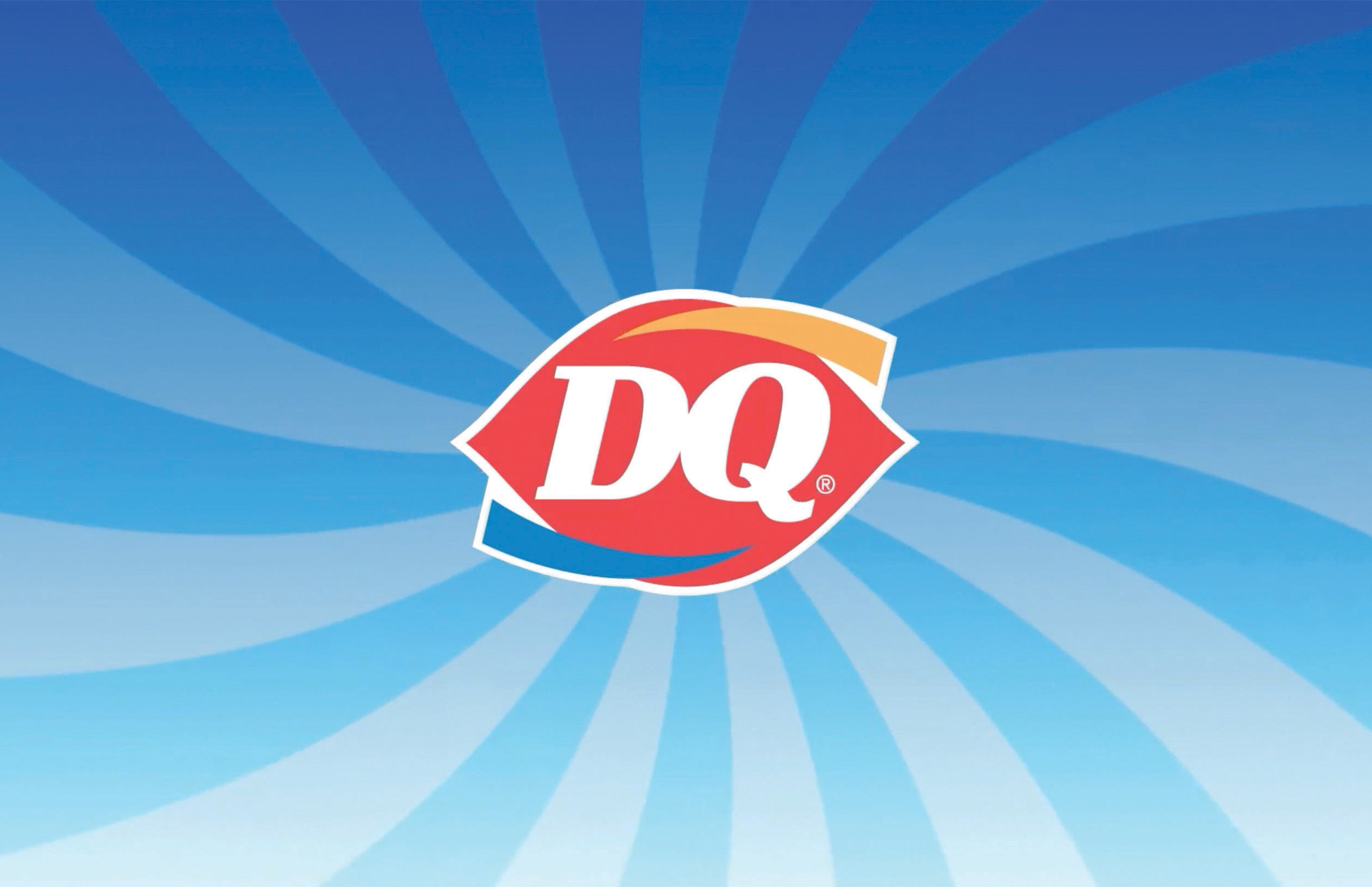
Dairy Queen
Dairy Queen is well known for their frozen treats such as blizzards and ice cream cakes. I decided to incorporate a blending animation using vector lines. I added some spinning to make an illusion of a blender mixing. For the logo reveal, I created a turbulent displace that resembled liquid filling up a cup. The background is stripes making a spiral motion and I think it fits Dairy Queen's brand as a fast-food restaurant. Overall, I wanted the animation to feel positive and lighthearted, reflecting Dairy Queen's mission to serve its customers happiness.
M&M's
M&M's is a brand that is colorful and fun in nature. In the animation, I wanted a way to display as many colored M&M's as I could. A single M&M drops from above then spins, showcasing its wide range of colors. Suddenly, a pile of M&M's falls from above, creating a formation of the brand's logo.
Miniso
Miniso is a retailer that strives on a joyful customer experience. Their products are aesthetically pleasing, fun, and practical, making a lasting impression. To reflect that, I animated the letterforms and smiley face in the logo to appear quirky and bouncy, without overdoing it with extra visuals. The logo's shopping bag pops up at the end, capping off the animation with a signature mark of the brand's identity.
Shazam
Shazam is a music recognition app, allowing users to identify a song in a touch of a button. It can be described as technogically advanced and intelligent. I wanted to animate the logo in a way that alludes to music and the process of having a song identified. The logo spins, then lines appear surrounding it, resembling a vinyl record. The logo's white lines appear, then the word Shazam pops up along with blue rings, a graphic representation of sound waves.
Spotify
Spotify is global brand, bearing a modern and busy interface. It provides a platform for people to share their creativity and constantly adapts to popular trends. My animation starts off with moving bars that resemble sound bars or audio waveforms. After they fade out and scale down, the green circle of the Spotify logo pops up, followed by the three signature black lines that accompany it. The lines appear from the bottom then adjust into place by moving upwards, making it appear like sound waves omitting from a source. The logo finally scales down, and the Spotify wordmark appears to cap the animation off.
Tropicana
Tropicana is a brand that is vibrant and strives to brighten peoples' days. My animation starts off with multi-colored turbulent displaces that reveal the logo's wordmark. They are meant to show the range of Tropicana's juice products filling up a glass. Finally, the leaf that comprises the 'i' pops up along with yellow lines that 'burst' beside it briefly, which are meant to resemble the sun's rays.