Goal & Purpose
The goal of this project was to design three posters for an architectural firm, utilizing a type dominant solution, an image dominant solution, and a type and image balanced solution. The look and feel of the posters have to reflect the firm's architectural style and values. In addition, a quote from the firm is to be used somewhere on each poster. The posters serve to promote the company while staying true to its style and mission.
Heerim Architects & Planners
I decided to design the posters for a firm called Heerim Architects & Planners. Their firm's headquarters are located in Seoul, South Korea, and it is founded on January 10, 2010. They have offices throughout various countries. Their quote is "We Design Tomorrow and Beyond." Based off their quote, I can infer that their motto is to design not only for the present, but for the future as well, ensuring that designs are structurally sound for many years, employing a modern and futuristic aesthetic. They strive for client satisfaction and happiness. With creative and innovative minds, they expand worldwide where opportunities bring them.
Logo
I found that the firm's original logo was not striking or bold enough. I do not like their typeface choice because it looked too traditional for a sans-serif. For my redesign, I stylized the logo in all caps, used a bolder typeface with wider strokes, and implicated 3D space.
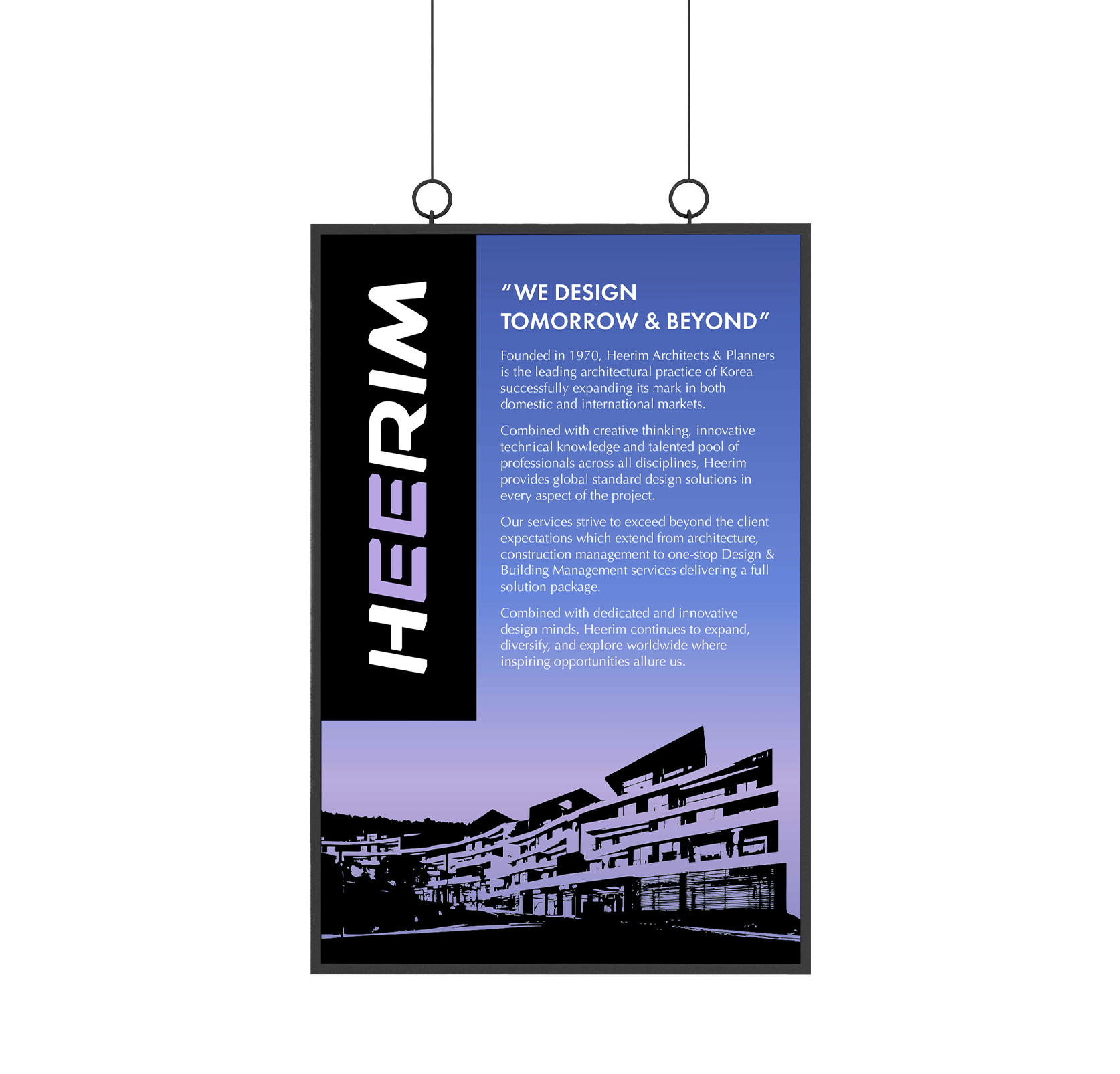
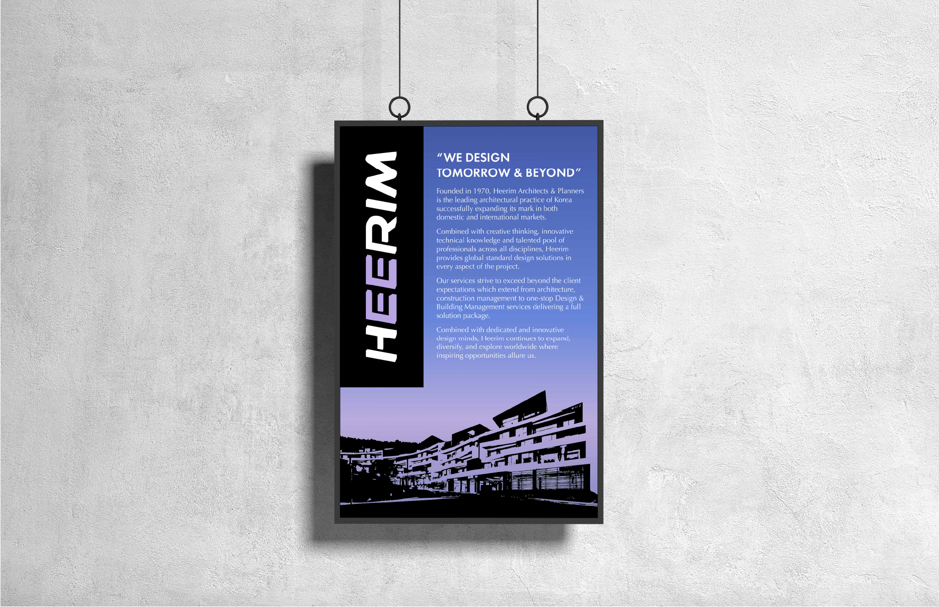
Poster 1
This poster is type dominant, so I made the logo stand out behind a black background. I highlighted the quote in a bold style and placed some body text beneath it. An image of one of the firm's buildings is traced out in black and placed at the bottom of the poster. There is a purple gradient background which I think helps bring a burst of color and visual interest to the poster.
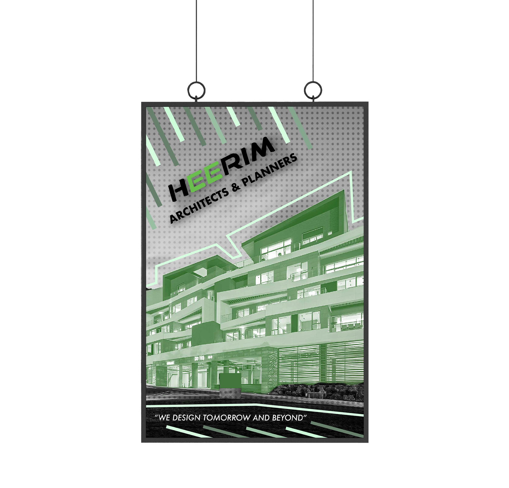
Poster 2
This next poster is image dominant. I wanted to emphasize more of the building's structural elements and since the building I included on this poster has a heavy use of line, I decided to use line as a complimentary graphic. The poster features an image of the building in a monochrome green in front of a halftone greyscale background. By making the poster greyscale excluding the image of the building and the graphical lines, it helps bring emphasis to the imagery instead of the logo and type.
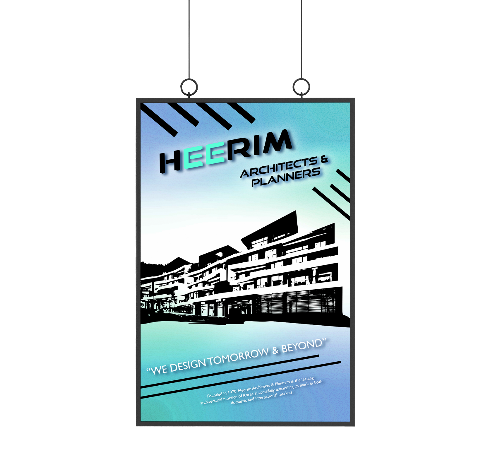
Poster 3
The final poster balances both type and image. To achieve this, first I decided to place the image of the building in between the logo and quote. The size of the image is moderate and there are directional lines that surround the logo and quote, placing some emphasis on the type. What makes the poster balanced typographically and visually is that the image of the building does not take too much attention away from the type. The type is strategically placed and highlighted in a way that makes it have equal emphasis and focus as the image. There is also some slight texture in the background to enhance the look.